Creating a Cohesive Color Palette
- Oct 11, 2021
- 2 min read
Recently, a follower on instagram asked a really great question:
"How do you create a cohesive color story in your home without painting the whole house the same color?"
We thought we'd share the answer with you too; b/c - in the words of my 3rd grade teacher - "If you have a question, chances are someone else has the exact same one!" (Anyone else remember those tried & true teacher words?)
Here are 3 tips to help you create a color palette that you'll be excited to come home to!
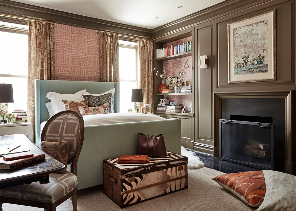
*To illustrate these steps, we'll walk through the gorgeous NYC home of St. Frank founder, Christina Bryant.
1. Choose two to five "hero" colors.
These are colors that make you happy and that you'd love to see scattered around your house.
Keep in mind: Though you may have 3 main colors, you can (and should) use other shades of these colors throughout the home as well. For example: I love blue; but if I only use one shade of blue, it will fall a bit flat and get old after a while. A better (and more exciting) option would be to scatter smokey blues, peacock blues, and even deep navy in different parts of your home.

*In her beautifully bold living room, Christina has chosen: Blue, Mustard, with pops of red and pink.
Muted pink and a softer shade of blue appear in Christina's master suite below.
2. Choose accent colors that complement the main color of each space. To take the overwhelm out of this step, use a color wheel! Complementary colors are directly across from each other on the wheel and will always look stunning together. For a more tonal feel, try colors that are right next to each other on the color wheel. In both examples, make sure you're using colors that have the same hue and brightness.
*For example, the mustard color of the sofa in Christina's living room is complementary to the deep blue on the walls.
3. Decide on a ratio of color for each space. We generally love a 60/30/10 mix. Where 60% is the main color, 30% of a secondary and 10% of a "pop" or accent.
*Stick to the same colors in the next room; but vary the ratio. (Ex: The pop of pinkish/red in the living room now becomes the main color in Christina's closet below.)

Ok that's a wrap for today's Color Course 101; but in case you're still in a bind with color selections, get in touch HERE, we'd love to help!
xo,


Comments